Buttons with popup boxes
HTML Buttons
If you are looking for a way to enhance your Canvas course navigation beyond using standard blue hyperlinked text, then creating HTML buttons can help you create interesting interactions for your students. You can link buttons to external Canvas course navigation content (e.g. Pages, Module, Gradebook, etc.), webpages, documents for download, or even a mailto email link (i.e. clicking the button would draft an email).

Example of Home Page navigation and information buttons
Using the built-in Canvas CSS code, we can use classes to help determine the size and color of the buttons using some very basic HTML coding. There are three components of a Canvas button that we will explore:
The button classes - sizing and color
The button text (e.g. Syllabus, Course Home Page, download a document)
The hyperlink - what happens when students click on your button
To create a button, you will need to access your Canvas page’s HTML editor. Buttons are technically hyperlinks. So if you would like, you can complete this first step in the Rich Content Editor. Type out the words you want for the button and hyperlink them. For example, if I wanted a button that says “Home”, then I would type that and hyperlink to it to wherever “Home” is in your course. This code may look something like this in your HTML editor:
<a href="https://www.howtocanvas.com/">Home</a>
You would replace the URL (https://…) with your own URL - perhaps a link to a resource in your Canvas course or an external website. Now you have your hyperlink and you need to add some code to make it look like a button. Canvas buttons are really just stylized hyperlinks. In order convert your hyperlink to a button you will need to add this code to your anchor tag ( <a> ): class=”btn”. Your code will now resemble this:
<a class="btn" href="https://www.howtocanvas.com/">Home</a>
You will need to add two more classes to you button. First, you need to determine the size of your button. Essentially the sizes are mini, small, medium, and large. The medium button is really a class called “group” and has less rounded corners than the large button.

The code for these buttons is as such:
<a class="btn btn-mini">mini button</a>
<a class="btn btn-small">small button</a>
<a class="btn btn-group">"medium" button</a>
<a class="btn btn-large">large button</a>
Now combine that code with our initial button. I’ll take the large button and come up with this:
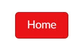
<a class="btn btn-large" href="https://www.howtocanvas.com/">Home</a>
That will give me a large clickable gray button that will take my students to the website (or a Canvas announcement, or the assignments page, for example). Canvas has a limited number of colors in their style guide for buttons. Using our current Home button, below are the various color options and their code (note, the buttons are screenshots and are not actual buttons on this website):

<a class="btn btn-large btn-primary" href="https://www.howtocanvas.com/">Home</a>

<a class="btn btn-large btn-warning" href="https://www.howtocanvas.com/">Home</a>
<a class="btn btn-large btn-danger" href="https://www.howtocanvas.com/">Home</a>

<a class="btn btn-large btn-success" href="https://www.howtocanvas.com/">Home</a>

<a class="btn btn-large btn-info" href="https://www.howtocanvas.com/">Home</a>

<a class="btn btn-large btn-link" href="https://www.howtocanvas.com/">Home</a>

<a class="btn btn-large btn-beta" href="https://www.howtocanvas.com/">Home</a>

<a class="btn btn-large btn-publish" href="https://www.howtocanvas.com/">Home</a>

<a class="btn btn-large btn-published" href="https://www.howtocanvas.com/">Home</a>

<a class="btn btn-large btn-unpublished" href="https://www.howtocanvas.com/">Home</a>
Popup Boxes!
The next element we will explore is how to create a popup box. Instead of the button taking your student to a course page or a webpage, you can create a clickable button that will show a content box on the screen. The box is 300 pixels wide and you can put whatever elements you would like: text, pictures, hyperlinks, etc.

Popup boxes in Canvas are a little complicated, but they can be done with fairly simple HTML code in the HTML editor. The first thing you will need to do is create the hyperlink to the popup box in your button code. This is done by specifying the URL in the anchor tag <a> to go to a certain place on the webpage. So the code will look something like:
<a class="btn btn-large btn-info" href="#professor">Home</a>
In this case, the URL is #professor. You can call it whatever you want - you just need to put a hashtag in front of it. Since I decided that the popup would be called #professor, I’ll create a <div> where I can house my popup content. I will need to add the following classes to my <div>:
<div id="professor" class="enhanceable_content dialog">
This is where your content will go. You can put placeholder text and edit it in the RCE, but it’s really best if you format it in the HTML editor if you are able.
</div>
Be mindful that the content will look strange in the RCE. When the page is saved the <div> will be hidden from the students until they click on the button. You can also incorporate popups to non-button hyperlinked text if you would like. To see all of the buttons in action, feel free to visit my Canvas page.
Please consider subscribing to our YouTube channel for more Canvas tips and tricks. It is so easy and so free. The only thing you have to do is click this link: http://bit.ly/how2canvas
And follow us on social media
Twitter: https://twitter.com/HowToCanvas
Instagram: https://www.instagram.com/HowToCanvas
Facebook: https://www.facebook.com/HowToCanvas