

How to Crop Images into Circles with CSS
Canvas LMS gives us plenty of options for adding images to a page, but sometimes the image you upload is not quite the shape you want.
Maybe you have a square headshot that would look better as a circular profile image. Maybe you have a tall portrait that you want to crop into a circle without opening Photoshop, Canva, or another image editor.
With a little CSS, you can do that directly on a Canvas page.
The nice part is that we are not actually changing the original image. The file you uploaded to Canvas stays exactly the same. We are simply controlling how that image is displayed on this particular page.
I like to think of this as a circle image hack.
Here is the example from the video

The image on the left is naturally square and uploaded to Squarespace (the platform I use to run this website). The image on the right is the same uploaded file but I used the following code:
<div style="width: 100%; max-width: 400px; margin: 0px auto; border-radius: 50%; overflow: hidden; background-color: #000000; border: 6px solid #b0751b;">
  <img style="display: block; width: 100%; height: auto;" src="https://images.squarespace-cdn.com/content/v1/5f7257840c54bb295444822f/7c07f4ce-02a6-44aa-a7d5-bb2732551a00/profile+pop.jpg?format=2500w" alt="Square image fit into a circle"  />
</div>
So let’s all break this down. Easiest thing would be for you to just copy the code and replace src="URL" with your own image. Just change URL to the file location (stored somewhere on the internet - such as in your course files) of your photo or graphic. Today I want to go beyond the simple copy/paste and show you what all that code means.
Start with a square image
The easiest version of this technique begins with an image that is already square, such as the image above. There are two primary parts to this code. The outer <div> creates the container that will become our circle. The <img> inside it controls how the actual image behaves inside that container.
Set the width
I put width: 100%. This allows the container to use 100 percent of the space available to it. That does not necessarily mean the entire width of the Canvas page. It means 100 percent of the width provided by the element containing it. If the image is inside a Canvas grid column, for example, it can use the full width of that column.
Set a Maximum Width
I put max-width: 400px. I usually do not want an image growing indefinitely on a large screen, so I also give it a maximum width. These two properties work together:
width: 100%;
max-width: 400px;
You can think of this as telling the browser: Use the available space, but do not get larger than 400 pixels.
If the available space is only 300 pixels wide, the image can shrink to 300 pixels. If the available space is 800 pixels wide, the image stops growing at 400 pixels.
Center the Image
This would be optional because sometimes you might not want the image centered. In my case I did want that, and the code margin: 0px auto; centers the container horizontally. The first value controls the top and bottom margins:
0px
If I wanted space above or below the image (which often I do) then you would adjust that number. For more information on margins and padding, refer to the page Understand margins, paddings, and borders. The second value controls the left and right margins:
auto
Setting the horizontal margins to auto causes the browser to divide the remaining space evenly between the left and right sides. This part of the code is not responsible for the circular effect. It simply positions the image.
Turn the Square into a Circle
Now we get to one of the most important lines:
border-radius: 50%;
Normally, border-radius rounds the corners of an element. For example:
border-radius: 10px;
would give you a square/rectangle with slightly rounded corners. But when you increase the border-radius to 50%; then those rounded corners form a circle. But it will only be a circle if the width and height are equal. If it is a rectangle with the height either shorter or longer than the width then you’ll get an oval.
A simple formula to remember is: Square + border-radius: 50% = circle
Hide Everything Outside the Circle
The next important property is:
overflow: hidden;
This is what makes the effect really work. In fact, with out it the whole effect will look very strange. The image still exists as a square behind the scenes. We are not deleting parts of it or physically cutting the image into a circle. Instead, overflow: hidden tells the browser:
Do not display anything that extends beyond the boundaries of this container.
Since we have already made the container circular, anything outside that circle becomes invisible. This is a great property to remove temporarily if you are experimenting with the code. Let’s compare what happens with and without overflow: hidden to make this easier to understand.
We obviously are much more interested in the left image than whatever is going on to the right.
Add a Border
I also added:
border: 6px solid #b0751b;
There are three instructions packed into this one line:
6px solid #b0751b
| | |
size style color
6px controls the thickness of the border. The larger the number, the thicker the border will be. A size of 1px is the smallest possible. Solid tells the browser that we want a solid line - as opposed to dotted, dashed, or something else. I chose #b0751b as the hexadecimal value for the border color. I used a color picker and got my color from the hair of the character. You’ll want to choose something related to your picture. Or go with black (#000000) or something off-black (such as #262625)
Because the container already has: border-radius: 50%; the border follows that circular shape. The border is completely optional. You can remove it, make it thinner, or use a color that matches the design of your course.
Now Look at the Image Inside the Container
The outer container creates the circular viewing area. The actual image uses this CSS:
<img style="display: block; width: 100%; height: auto;" />
These properties determine how the picture behaves inside it.
display: block;
Images behave as inline elements by default. That can occasionally create a small amount of unwanted space beneath an image because of the way browsers align inline content. Setting the image to:
display: block;
makes its behavior a little more predictable inside the container.
width: 100%;
This tells the image to fill the width of its container (which is the <div>). If the container is 400 pixels wide, the image becomes 400 pixels wide. If the container shrinks to 250 pixels, the image shrinks with it.
height: auto;
This tells the browser to calculate the height automatically based on the image's original proportions. Because our original image is square, this works especially well. If the image becomes 400 pixels wide, its automatic height is also 400 pixels. If it becomes 250 pixels wide, its height becomes 250 pixels. That keeps our one-to-one square proportion intact.
In reality height: auto probably isn’t needed, but I like to play it safe because I would never want to see a tall or wide image being squished into a square container. I have seen that faaar too often on the internet and I don’t want to be a perpetrator.
The Image Source
The src attribute tells Canvas which image to display:
src="YOUR-IMAGE-URL"
If the image has already been uploaded to your Canvas course, Canvas will provide a URL that points to that file.
For example, a Canvas image URL might look something like:
/courses/[your course number]/files/[the file number of your picture]/preview
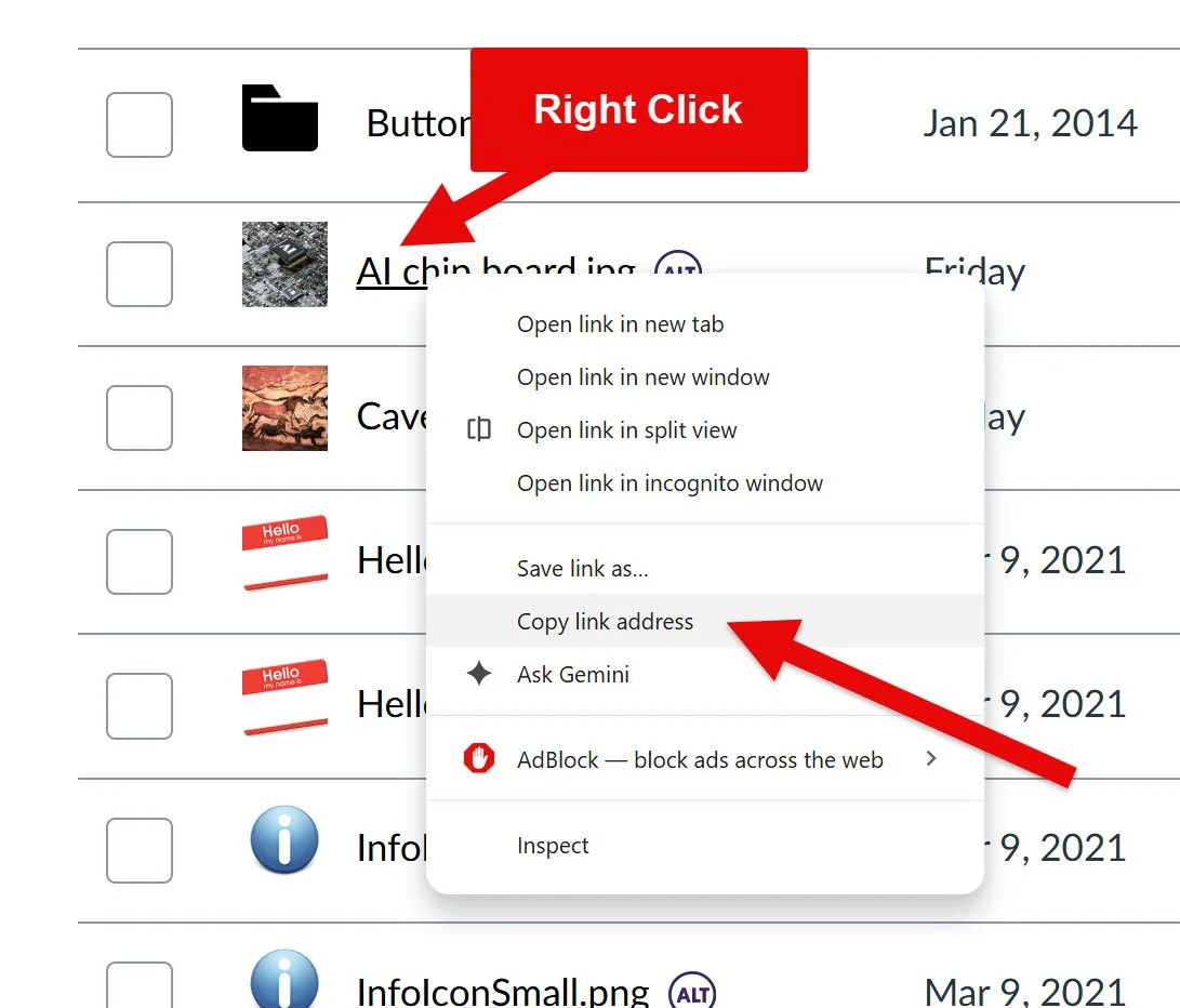
Or you might point to an image on the internet that isn’t in your Canvas course, such as https://images.unsplash.com/photo-1704908812638-c67e28f9fc87. Nothing about our CSS changes that original file. You can use the same image somewhere else in your course and display it normally as a square.
The circular effect applies only where you use this particular code.
Do Not Forget the Alt Text
The image also needs appropriate alt text:
alt="Description of image"
The alt text should describe the meaningful content or purpose of the image. If this were an instructor photograph, for example, something like this might make sense:
alt="Dr. Sean Nufer with his camera and ukulele"
I would generally not write something like: alt="Circular image"
The fact that the image is circular is a visual design choice. It is usually not the important information that needs to be communicated to someone using a screen reader. Screen readers also know when something is an image. Read more about principles of accessibility on our dedicated page.
The Square Image Version in Plain English
So what is actually happening here?
We start with a square image.
We place that image inside a container.
We use: border-radius: 50%; to make the container circular.
Then we use: overflow: hidden; to hide anything outside that circular boundary.
Finally: width: 100%; height: auto; allow the original square image to fill the space while maintaining its proportions.
That is the basic circle image hack.
What If the Original Image Is Rectangular?
Things become a little more interesting if the original photograph is not square. Suppose you have a portrait image that is approximately one unit wide and two units tall.
If you simply apply border-radius: 50% to that shape, you will not get a circle. You will get an oval.
That happens because border-radius follows the dimensions of the element.
A square becomes a circle.
A rectangle becomes an oval.

<div style="width: 100%; max-width: 400px; margin: 0px auto; border-radius: 50%; overflow: hidden; background-color: #000000; border: 6px solid #b0751b;">
  <img style="display: block; width: 100%; height: auto;" src="https://images.squarespace-cdn.com/content/v1/5f7257840c54bb295444822f/9a852325-8c99-4967-b17d-999965935b53/profile+pop.jpg?format=2500w" alt="Square image fit into a circle"  />
</div>
Astute readers will recognize that this code is literally the same code as I shared at the top of the screen with the exception that the src URL is different. Even if the image is rectangle, it’s still possible to contain it within a circular frame.
Create a fixed square container
Consider this code:
<div style="width: 300px; height: 300px; margin: 50px auto; border-radius: 50%; overflow: hidden; border: 6px solid #b0751b;"> <img style="display: block; width: 100%; height: auto; margin-top: -150px;" src="YOUR-IMAGE-URL" /> </div>
That should all look familiar at this point, but an important change is that we explicitly set both the width and the height.
width: 300px;
height: 300px;
Now we know that our container is exactly: 300 × 300 pixels and that gives us the one-to-one square we need. with the border-radius: 50%; we can turn that square into a circle.
What Happens to the Portrait Image?
The image inside still uses: width: 100%; height: auto;
Our container is 300 pixels wide. If the original photograph has a one-to-two ratio, making it 300 pixels wide means the browser will render it at approximately:
300px wide
600px tall
The browser is preserving the image's original proportions.
We are not squeezing that 600-pixel-tall image into a 300-pixel-tall square.
Instead, the container gives us a 300 × 300 viewing window. And:
overflow: hidden;
hides the portions of the photograph that extend beyond that window.
Start at the Top of the Portrait
If we use: margin-top: 0px; our image begins at the top of the container. The code would look like this:
<div style="width: 300px; height: 300px; margin: 50px auto; border-radius: 50%; overflow: hidden; border: 6px solid #b0751b;">
    <img style="display: block; width: 100%; height: auto; margin-top: 0px;"
         src="YOUR-IMAGE-URL"/>
</div>
If the rendered image is 300 pixels wide and 600 pixels tall, our 300-pixel-tall container essentially shows the upper half.
You can picture it like this:
┌───────────────┐
│ │
│ VISIBLE │
│ 300×300 │
│ │
├───────────────┤
│ │
│ HIDDEN │
│ 300×300 │
│ │
└───────────────┘
Everything below the visible area is still there. The “overflow: hidden” code simply prevents us from seeing it.
Reposition the Image with margin-top
What if the important part of the photograph is not near the top? That is where this property becomes useful:
margin-top: -150px;
A negative top margin moves the image upward behind our circular window. For our example, the image is approximately 600 pixels tall and the visible area is only 300 pixels tall. That leaves: 600 - 300 = 300 extra pixels. If we want to center the crop mathematically, we can divide those extra pixels in half: 300 ÷ 2 = 150. So:
margin-top: -150px;
moves the image upward by 150 pixels. Now approximately 150 pixels are hidden above the viewing area and another 150 pixels are hidden below it, and only the middle of the portrait becomes visible.
Conceptually:
┌───────────────┐
│ 150px hidden │
├───────────────┤
│ │
│ VISIBLE │
│ 300×300 │
│ │
├───────────────┤
│ 150px hidden │
└───────────────┘
You do not have to use exactly -150px. That number happens to center this particular one-to-two portrait inside a 300-pixel square. You can adjust it based on the photograph. For example:
margin-top: 0px;
shows the upper portion of the photograph.
margin-top: -100px;
moves the image upward by 100 pixels.
margin-top: -150px;
centers our 300 × 600 example.
margin-top: -200px;
moves the photograph farther upward and reveals content that sits lower in the original image. I like to think of margin-top as a manual crop-position control. Imagine placing a photograph behind a circular hole cut into a piece of paper where the circular hole stays in place. You can slide the photograph up or down behind it until the part you want appears in the opening.
That is essentially what we are doing with CSS. The container is the viewing window and the image sits behind it. Remember that “overflow: hidden” hides everything outside the viewing window. margin-top lets us reposition the photograph behind it.
At the end of the day, it’s likely that if your intention is a circular image then you might just want to start with a square image. Crop it and then upload it to Canvas. But this approach can let us use the same image on multiple pages, and I think there is value in knowing how to code and how to make these fine adjustments yourself. It shows you’re knowledgeable a flexible and that you provide value.
Final thoughts
This is a useful Technique for Canvas course design. It’s really a small CSS trick, but it can be useful in quite a few places. Circular images can work nicely for instructor introductions, faculty profiles, student spotlights, character or scenario images, module introductions, and other places where a traditional rectangular photograph feels a little too rigid.
Know that you are not limited to accepting an uploaded image exactly as it appears in Files. With a few carefully chosen CSS properties, you can control how that image is presented while leaving the original file untouched. You can create the shape you want, place the image inside it, and hide everything that falls outside the boundary. Sometimes I wish real like were that simple.
The URL source will ultimately look something like: https://[yourinstitution].instructure.com/courses/[course ID]/files/[photo ID]/preview
In reality, you can also shorten that to something like:
background: url(“/courses/[course ID]/files/[Photo ID]/preview
Either writing it longhand starting with https:// or just starting the URL at /courses… will work. Ultimately these are the parts that the browers is look at:
/courses/ - tells Canvas that the URL is pointing to something inside a course
course ID - Canvas’s internal numeric identifier for that course
/files/ - tells Canvas that the next value refers to a file stored in the course
file ID - Canvas’s internal numeric identifier for that specific uploaded file
/preview - tells Canvas to display the file in preview form, which is what we want because without that Canvas will automatically download the picture instead of display it (I’m not sure what’s going on in the backend with that)
Once you have your photo URL then you’re halfway there to your parallax effect - you just need some code around it. The basic structure we’re looking at for this effect is:
<section>
    <div>
        <div>
            <h3> </h3>
            <p> </p>
        </div>
    </div>
</section>
Start with the outer section
Let’s start filling that in. If we start with <section>, this is a simple line in order to give us our first container for this part of the page. I would probably put a margin in there, such as
margin: 25px 0;
This would control the space outside the section. The first number applies space above and beneath the section, and the second number puts margin on the sides. I might want some space (25 pixels) above and below but not left and right. I don’t need the extra horizontal space abut I do want the other breathing room. Feel free to test that with exaggerated numbers like 500px.
Now let’s build the image container
The next element is a <div> that creates the large visual section. Here is what we have:
<div style="display: flex; align-items: center; justify-content: center; min-height: 340px; padding: 30px; overflow: hidden; background: url('https://images.unsplash.com/photo-1697577418970-95d99b5a55cf?q=80&w=1896&auto=format&fit=crop&ixlib=rb-4.1.0&ixid=M3wxMjA3fDB8MHxwaG90by1wYWdlfHx8fGVufDB8fHx8fA%3D%3D') center center / cover no-repeat fixed #000000; border-radius: 18px; border: 6px solid #333333;">
There is quite a bit happening here, so let’s look at the CSS properties separately.
display: flex
This turns the container into a Flexbox layout. In our example, I am using Flexbox primarily because it gives me an easy way to center the content panel inside the background image. For this example, think of it like: I want to use flexible positioning for the content inside this box.
align-items: center;
This centers the inner content panel vertically. Without it, the card may sit toward the top of the image area, but with it the card stays centered along the vertical axis.
justify-content: center;
This centers the content panel horizontally. Together, these three lines:
display: flex;
align-items: center;
justify-content: center;
are essentially telling the browser to put whatever is inside this container right in the middle.
min-height: 340px;
This tells the browser that the section should be at least 340 pixels tall. That’s an arbitrary number that I thought looked good with that particular image on that particular page. Play around with it though.
I prefer min-height here instead of height. A fixed height would say “This section must always be exactly 340 pixels tall.” Whereas a minimum height instructs the browser to make the section at least 340 pixels tall, but allow it to grow if the content needs more room.
That is generally safer for instructional content because text may wrap differently on smaller portrait screens (i.e. a phone viewing the content vertically). You can adjust this value depending on how dramatic you want the section to feel.
Feel free to try a more compact version:
min-height: 260px;
For something more visually prominent:
min-height: 450px;
padding: 30px;
Padding creates space inside the container. Don’t overlook this because it keeps the inner content card from touching the outer edges and feeling cramped and awkward. We’ve discussed this concept in the past and I highly recommend that you review the page on margins and padding if you want a refresher.
A useful way to remember the distinction is:
margin creates space outside an element
padding creates space inside an element
Here, that 30 pixels gives the content card some breathing room.
overflow: hidden;
This hides anything that extends beyond the outer edges of the container, which becomes especially useful because the container also has rounded corners. Without overflow, hidden, visual content can sometimes extend beyond those rounded edges.
The background line
This is the most important part. The one line contains several different background settings. It looks intimidating at first, but it is really just a compact way of combining several properties. Let's break it down.
url(...)
This tells Canvas which image to use. I might use the code:
url('/courses/99483/files/32699281/preview')
But your URL will be different. As I mentioned before I recommend keeping the image inside the same Canvas course whenever possible. This would reduce the chance that your students will encounter permission problems with an image stored somewhere else.
center center
This controls where the image is positioned. The first value controls horizontal positioning, and the second controls vertical positioning. So:
center center
means we want to keep the image centered horizontally and vertically. You can (and should) experiment with alternatives. For example:
center top
keeps the image centered horizontally but favors the top of the image. Or:
center bottom
favors the bottom. This is useful if the important part of your photograph keeps getting cropped and you want to make sure that it gets emphasized.
/ cover
The slash separates the background position from the background size. Cover tells the browser to make the image large enough to completely fill this section. This means part of the image may be cropped, which is exactly what we want in order to get the parallax effect. Cover ensures we won’t end up with empty space around the edges. I’ll reiterate that you want to pick a high resolution image that is capable of filling the screen. A stretched image doesn’t look great.
no-repeat
Background images can repeat by default to fill up the space. If the image is smaller than the container, the browser may try to tile it. We don’t want our course page to look like something resembling a 1997 web page from AOL. So just turn that off with “no-repeat” and only show the image once.
fixed
⬆️ This is the magic part that creates the parallax-style effect. Normally, the background moves with the section as the learner scrolls. When we set the background image to fixed then the image stays attached to the browser viewport instead. So the section itself moves, but the background appears to remain in place.
The easiest way to understand this is to think of the section as a window. As the page moves, the window moves across a background that appears stationary. That is what creates the illusion.
If you remove fixed:
background: url('IMAGE') center center / cover no-repeat #000000;
you still get a perfectly usable background-image section, but you lose the parallax-style movement. Give it a try: save the page without fixed and scroll through it. Then add fixed and scroll through it again.
The difference becomes very obvious.
#000000
This is the fallback background color. If the image does not load for some reason, the section will still have a black background instead of being completely blank. You could substitute another color that fits your course/page design.
border-radius: 18px;
This rounds the corners of the image section. Higher values create more rounded corners. For example:
border-radius: 30px;
would make them more pronounced. If you want square corners then either remove the border-radius of set it to:
border-radius: 0;
border: 6px solid #333333;
This creates the dark border around the section. The three parts are:
6px - border thickness
solid - border style
#333333 - border color
You can make it thinner by choosing something like 2px or really thick like 12px. Or you can remove the border completely. I like the border because it helps visually separate the image section from the rest of the Canvas page.
Add the content card
Inside the background section is another <div>:
<div style="
    max-width: 570px;
    padding: 26px;
    background: #fffaf3;
    border-radius: 12px;
    text-align: center;
    border: 2px solid #333333;
">
This creates the readable panel in the middle of the image. I honestly think this part is just as important as the parallax effect itself. The parallax image would look fairly out of place otherwise. You could place white text directly on top of the photograph, but readability would depend heavily on the image - the gradients, the contrasts, how busy the elements are, etc. A dark section of the photograph might work with light font, but a bright section might not.
So instead, this panel creates a predictable reading surface with steady and solid contract for the text. Also, with the bos the background image can be visually interesting without the text having to fight with it.
max-width: 570px;
This limits how wide the content card can become. My number here is completely arbitrary and you should play around with values. This width doesn’t force the card to always be 570 pixels wide. It simply says: Do not let this grow beyond 570 pixels. That helps keep lines of text at a manageable length.
padding: 26px
Again, this creates space inside the card. Without padding, the text would sit uncomfortably close to the edges.
background: #fffaf3;
This gives the card its light cream background. Choose a color that fits your page. I prefer an opaque background here because it creates dependable contrast. You could use white: background: #ffffff; or another light color that fits your course.
border-radius: 12px;
This rounds the corners of the inner card. Notice that the outer section uses:
border-radius: 18px;
while the inner card uses:
border-radius: 12px;
The values are related without being identical. I think that gives the design a little visual hierarchy.
text-align: center;
This centers the heading and paragraph. I think centered text works well here because this is a short transitional statement. I would be more cautious with centered text for long readings. I also probably wouldn’t use this effect for a long reading. But if you did have several paragraphs of instructional content, I would probably switch to: text-align: left;
border: 2px solid #333333;
This creates a thin outline around the content card and helps separate the cream panel from the photograph behind it.
Style the heading
The heading uses:
<h3 style="
    margin: 0 0 12px 0;
    color: #b34000;
    font-size: 27px;
    line-height: 1.25;
">
When we set up the margins
margin: 0 0 12px 0;
This uses four margin values: top right bottom left. I think of it as how I learned a compass when I was a kid with north, east, south, west (as if we really needed a mnemonic for that, I still think: never eat soggy wheaties). So: margin: 0 0 12px 0; means:
no margin above
no margin on the right
12 pixels below
no margin on the left
That creates a little space between the heading and paragraph without adding unnecessary spacing elsewhere.
color: #b34000;
This changes the heading text to a warm rust-orange. You could replace this with your own course accent color.
font-size: 27px;
This controls the size of the heading. You can adjust it, but I would avoid going dramatically larger unless the panel itself is also larger.
line-height: 1.25;
This controls the spacing between lines if the heading wraps. A tighter line height generally works well for headings.
Style the paragraph
The paragraph is simpler and just specifies a color I like #3f515e as it creates a dark blue-gray text color rather than pure black. It works well against the cream background while keeping the page visually softer.
Why should we even use this effect??
Does this really even support the learning experience? I would say that when used intentionally and strategically then yes if can be an effective visual cue for your learners. Your page may move through a certain sequence:
Introduction
↓
Key concepts
↓
Examples
↓
PARALLAX SECTION
"Now think about the human implications."
↓
Application activity
The visual change of the parallax effect can reinforce the conceptual shift of the content. Your page may move from discussions of the topic in broad terms but then you want a design element that supports an intellectual shift or sets up an activity. The parallax effect could work well there because it collects attention and looks interesting.
Just don’t use this everywhere! Think about how Apple has managed their website. They typically have some wow factors but they don’t go overboard and overwhelm the viewer with excessive stimuli. Our parallax is more of a punctuation or emphasis rather than a staple. A single use feels intentions, whereas 5 uses on one page feels like a web circus.
Customize it
If you are interested in customizing your effect then here are some low-hanging modifications you could try:
min-height
Try changing it from 340px; to 450px; or 250px;move the image up
You can change: center center, to center bottom or topremove the parallax behavior
Delete “fixed” from the background declarationchange the color card
Try: background: #b20a01;make the border more or less subtle
border: 2px solid #333333; or
border: 16px solid #333333;
Canvas sanitizes HTML and CSS entered through the Rich Content Editor. That means it is a good habit to test custom code after it has passed through the normal Canvas editing process. My usual test is:
Paste the code into the HTML editor.
Save the page.
Reopen the page for editing.
Return to the HTML editor.
Save it again.
Confirm that the effect still works.
Test the page in Student View.
That extra save cycle matters because sometimes custom code appears to work initially but changes after Canvas processes it again.
tl;dr
If you remember only one line from this tutorial, make it this one:
background: url('IMAGE') center center / cover no-repeat fixed #000000;
And if you remember only one word from that line:
fixed
That is the part creating most of the magic.
Remember a little CSS can go a long way in Canvas and that our goal is not to make every page look flashy. I think it speaks volumes when we enhance our visual design deliberately so the moments that deserve extra attention actually feel different.
Please consider subscribing to our YouTube channel for more Canvas tips and tricks. It is so easy and so free. The only thing you have to do is click this link: http://bit.ly/how2canvas
And follow us on social media
Twitter: https://twitter.com/HowToCanvas
Instagram: https://www.instagram.com/HowToCanvas
Facebook: https://www.facebook.com/HowToCanvas