

Parallax Effect in Canvas (2026 edition)
Canvas pages are often functional before they are visually interesting. I wouldn’t say that’s necessarily a bad thing, but sometimes a page can benefit from a stronger visual transition between sections. A good way to beef up your page is with a parallax background effect. In our example here, the page scrolls normally while the background image appears to remain fixed in place. The result is a section that feels more dynamic without requiring JavaScript, external tools, or a complicated layout. All we need is a little simple CSS.
Here is the example from the video
<section>
    <div style="display: flex; align-items: center; justify-content: center; min-height: 340px; padding: 30px; overflow: hidden; background: url('https://images.unsplash.com/photo-1697577418970-95d99b5a55cf?q=80&w=1896&auto=format&fit=crop&ixlib=rb-4.1.0&ixid=M3wxMjA3fDB8MHxwaG90by1wYWdlfHx8fGVufDB8fHx8fA%3D%3D') center center / cover no-repeat fixed #000000; border-radius: 18px; border: 6px solid #333333;">
        <div style="max-width: 570px; padding: 26px; background: #fffaf3; border-radius: 12px; text-align: center; border: 2px solid #333333;">
            <h3 style="margin: 0 0 12px 0; color: #b34000; font-size: 27px; line-height: 1.25;"><strong>Beyond the Technology</strong></h3>
            <p style="margin: 0;"><span style="color: #3f515e;">Generative AI is not simply changing technology. It is changing communication, decision-making, creativity, learning, leadership, and expectations about work. Understanding the technology matters, but understanding how people respond to it may matter even more.</span></p>
        </div>
    </div>
</section>
I did make a few modifications. For the image source code, I used a public unsplash UTL instead of the file from my Canvas course, and I removed the margins that I needed for the example (parallax effects need a lot of space on the page in order to work well). My recommendation for having a good background image is that you first obtain a very high resolution image and then upload it into your course. You’ll then want to grab the URL to that image. You’ll need the ID for the code.
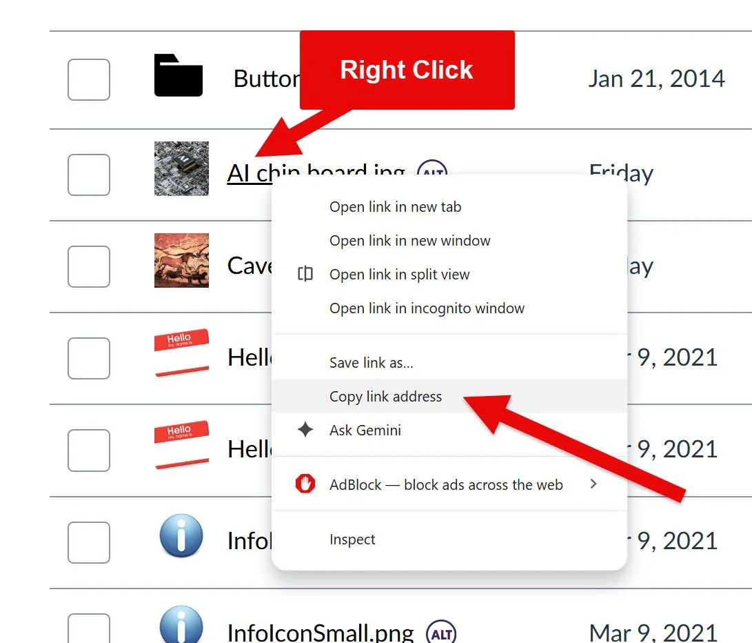
The URL source will ultimately look something like: https://[yourinstitution].instructure.com/courses/[course ID]/files/[photo ID]/preview
In reality, you can also shorten that to something like:
background: url(“/courses/[course ID]/files/[Photo ID]/preview
Either writing it longhand starting with https:// or just starting the URL at /courses… will work. Ultimately these are the parts that the browers is look at:
/courses/ - tells Canvas that the URL is pointing to something inside a course
course ID - Canvas’s internal numeric identifier for that course
/files/ - tells Canvas that the next value refers to a file stored in the course
file ID - Canvas’s internal numeric identifier for that specific uploaded file
/preview - tells Canvas to display the file in preview form, which is what we want because without that Canvas will automatically download the picture instead of display it (I’m not sure what’s going on in the backend with that)
Once you have your photo URL then you’re halfway there to your parallax effect - you just need some code around it. The basic structure we’re looking at for this effect is:
<section>
    <div>
        <div>
            <h3> </h3>
            <p> </p>
        </div>
    </div>
</section>
Start with the outer section
Let’s start filling that in. If we start with <section>, this is a simple line in order to give us our first container for this part of the page. I would probably put a margin in there, such as
margin: 25px 0;
This would control the space outside the section. The first number applies space above and beneath the section, and the second number puts margin on the sides. I might want some space (25 pixels) above and below but not left and right. I don’t need the extra horizontal space abut I do want the other breathing room. Feel free to test that with exaggerated numbers like 500px.
Now let’s build the image container
The next element is a <div> that creates the large visual section. Here is what we have:
<div style="display: flex; align-items: center; justify-content: center; min-height: 340px; padding: 30px; overflow: hidden; background: url('https://images.unsplash.com/photo-1697577418970-95d99b5a55cf?q=80&w=1896&auto=format&fit=crop&ixlib=rb-4.1.0&ixid=M3wxMjA3fDB8MHxwaG90by1wYWdlfHx8fGVufDB8fHx8fA%3D%3D') center center / cover no-repeat fixed #000000; border-radius: 18px; border: 6px solid #333333;">
There is quite a bit happening here, so let’s look at the CSS properties separately.
display: flex
This turns the container into a Flexbox layout. In our example, I am using Flexbox primarily because it gives me an easy way to center the content panel inside the background image. For this example, think of it like: I want to use flexible positioning for the content inside this box.
align-items: center;
This centers the inner content panel vertically. Without it, the card may sit toward the top of the image area, but with it the card stays centered along the vertical axis.
justify-content: center;
This centers the content panel horizontally. Together, these three lines:
display: flex;
align-items: center;
justify-content: center;
are essentially telling the browser to put whatever is inside this container right in the middle.
min-height: 340px;
This tells the browser that the section should be at least 340 pixels tall. That’s an arbitrary number that I thought looked good with that particular image on that particular page. Play around with it though.
I prefer min-height here instead of height. A fixed height would say “This section must always be exactly 340 pixels tall.” Whereas a minimum height instructs the browser to make the section at least 340 pixels tall, but allow it to grow if the content needs more room.
That is generally safer for instructional content because text may wrap differently on smaller portrait screens (i.e. a phone viewing the content vertically). You can adjust this value depending on how dramatic you want the section to feel.
Feel free to try a more compact version:
min-height: 260px;
For something more visually prominent:
min-height: 450px;
padding: 30px;
Padding creates space inside the container. Don’t overlook this because it keeps the inner content card from touching the outer edges and feeling cramped and awkward. We’ve discussed this concept in the past and I highly recommend that you review the page on margins and padding if you want a refresher.
A useful way to remember the distinction is:
margin creates space outside an element
padding creates space inside an element
Here, that 30 pixels gives the content card some breathing room.
overflow: hidden;
This hides anything that extends beyond the outer edges of the container, which becomes especially useful because the container also has rounded corners. Without overflow, hidden, visual content can sometimes extend beyond those rounded edges.
The background line
This is the most important part. The one line contains several different background settings. It looks intimidating at first, but it is really just a compact way of combining several properties. Let's break it down.
url(...)
This tells Canvas which image to use. I might use the code:
url('/courses/99483/files/32699281/preview')
But your URL will be different. As I mentioned before I recommend keeping the image inside the same Canvas course whenever possible. This would reduce the chance that your students will encounter permission problems with an image stored somewhere else.
center center
This controls where the image is positioned. The first value controls horizontal positioning, and the second controls vertical positioning. So:
center center
means we want to keep the image centered horizontally and vertically. You can (and should) experiment with alternatives. For example:
center top
keeps the image centered horizontally but favors the top of the image. Or:
center bottom
favors the bottom. This is useful if the important part of your photograph keeps getting cropped and you want to make sure that it gets emphasized.
/ cover
The slash separates the background position from the background size. Cover tells the browser to make the image large enough to completely fill this section. This means part of the image may be cropped, which is exactly what we want in order to get the parallax effect. Cover ensures we won’t end up with empty space around the edges. I’ll reiterate that you want to pick a high resolution image that is capable of filling the screen. A stretched image doesn’t look great.
no-repeat
Background images can repeat by default to fill up the space. If the image is smaller than the container, the browser may try to tile it. We don’t want our course page to look like something resembling a 1997 web page from AOL. So just turn that off with “no-repeat” and only show the image once.
fixed
⬆️ This is the magic part that creates the parallax-style effect. Normally, the background moves with the section as the learner scrolls. When we set the background image to fixed then the image stays attached to the browser viewport instead. So the section itself moves, but the background appears to remain in place.
The easiest way to understand this is to think of the section as a window. As the page moves, the window moves across a background that appears stationary. That is what creates the illusion.
If you remove fixed:
background: url('IMAGE') center center / cover no-repeat #000000;
you still get a perfectly usable background-image section, but you lose the parallax-style movement. Give it a try: save the page without fixed and scroll through it. Then add fixed and scroll through it again.
The difference becomes very obvious.
#000000
This is the fallback background color. If the image does not load for some reason, the section will still have a black background instead of being completely blank. You could substitute another color that fits your course/page design.
border-radius: 18px;
This rounds the corners of the image section. Higher values create more rounded corners. For example:
border-radius: 30px;
would make them more pronounced. If you want square corners then either remove the border-radius of set it to:
border-radius: 0;
border: 6px solid #333333;
This creates the dark border around the section. The three parts are:
6px - border thickness
solid - border style
#333333 - border color
You can make it thinner by choosing something like 2px or really thick like 12px. Or you can remove the border completely. I like the border because it helps visually separate the image section from the rest of the Canvas page.
Add the content card
Inside the background section is another <div>:
<div style="
    max-width: 570px;
    padding: 26px;
    background: #fffaf3;
    border-radius: 12px;
    text-align: center;
    border: 2px solid #333333;
">
This creates the readable panel in the middle of the image. I honestly think this part is just as important as the parallax effect itself. The parallax image would look fairly out of place otherwise. You could place white text directly on top of the photograph, but readability would depend heavily on the image - the gradients, the contrasts, how busy the elements are, etc. A dark section of the photograph might work with light font, but a bright section might not.
So instead, this panel creates a predictable reading surface with steady and solid contract for the text. Also, with the bos the background image can be visually interesting without the text having to fight with it.
max-width: 570px;
This limits how wide the content card can become. My number here is completely arbitrary and you should play around with values. This width doesn’t force the card to always be 570 pixels wide. It simply says: Do not let this grow beyond 570 pixels. That helps keep lines of text at a manageable length.
padding: 26px
Again, this creates space inside the card. Without padding, the text would sit uncomfortably close to the edges.
background: #fffaf3;
This gives the card its light cream background. Choose a color that fits your page. I prefer an opaque background here because it creates dependable contrast. You could use white: background: #ffffff; or another light color that fits your course.
border-radius: 12px;
This rounds the corners of the inner card. Notice that the outer section uses:
border-radius: 18px;
while the inner card uses:
border-radius: 12px;
The values are related without being identical. I think that gives the design a little visual hierarchy.
text-align: center;
This centers the heading and paragraph. I think centered text works well here because this is a short transitional statement. I would be more cautious with centered text for long readings. I also probably wouldn’t use this effect for a long reading. But if you did have several paragraphs of instructional content, I would probably switch to: text-align: left;
border: 2px solid #333333;
This creates a thin outline around the content card and helps separate the cream panel from the photograph behind it.
Style the heading
The heading uses:
<h3 style="
    margin: 0 0 12px 0;
    color: #b34000;
    font-size: 27px;
    line-height: 1.25;
">
When we set up the margins
margin: 0 0 12px 0;
This uses four margin values: top right bottom left. I think of it as how I learned a compass when I was a kid with north, east, south, west (as if we really needed a mnemonic for that, I still think: never eat soggy wheaties). So: margin: 0 0 12px 0; means:
no margin above
no margin on the right
12 pixels below
no margin on the left
That creates a little space between the heading and paragraph without adding unnecessary spacing elsewhere.
color: #b34000;
This changes the heading text to a warm rust-orange. You could replace this with your own course accent color.
font-size: 27px;
This controls the size of the heading. You can adjust it, but I would avoid going dramatically larger unless the panel itself is also larger.
line-height: 1.25;
This controls the spacing between lines if the heading wraps. A tighter line height generally works well for headings.
Style the paragraph
The paragraph is simpler and just specifies a color I like #3f515e as it creates a dark blue-gray text color rather than pure black. It works well against the cream background while keeping the page visually softer.
Why should we even use this effect??
Does this really even support the learning experience? I would say that when used intentionally and strategically then yes if can be an effective visual cue for your learners. Your page may move through a certain sequence:
Introduction
↓
Key concepts
↓
Examples
↓
PARALLAX SECTION
"Now think about the human implications."
↓
Application activity
The visual change of the parallax effect can reinforce the conceptual shift of the content. Your page may move from discussions of the topic in broad terms but then you want a design element that supports an intellectual shift or sets up an activity. The parallax effect could work well there because it collects attention and looks interesting.
Just don’t use this everywhere! Think about how Apple has managed their website. They typically have some wow factors but they don’t go overboard and overwhelm the viewer with excessive stimuli. Our parallax is more of a punctuation or emphasis rather than a staple. A single use feels intentions, whereas 5 uses on one page feels like a web circus.
Customize it
If you are interested in customizing your effect then here are some low-hanging modifications you could try:
min-height
Try changing it from 340px; to 450px; or 250px;move the image up
You can change: center center, to center bottom or topremove the parallax behavior
Delete “fixed” from the background declarationchange the color card
Try: background: #b20a01;make the border more or less subtle
border: 2px solid #333333; or
border: 16px solid #333333;
Canvas sanitizes HTML and CSS entered through the Rich Content Editor. That means it is a good habit to test custom code after it has passed through the normal Canvas editing process. My usual test is:
Paste the code into the HTML editor.
Save the page.
Reopen the page for editing.
Return to the HTML editor.
Save it again.
Confirm that the effect still works.
Test the page in Student View.
That extra save cycle matters because sometimes custom code appears to work initially but changes after Canvas processes it again.
tl;dr
If you remember only one line from this tutorial, make it this one:
background: url('IMAGE') center center / cover no-repeat fixed #000000;
And if you remember only one word from that line:
fixed
That is the part creating most of the magic.
Remember a little CSS can go a long way in Canvas and that our goal is not to make every page look flashy. I think it speaks volumes when we enhance our visual design deliberately so the moments that deserve extra attention actually feel different.
Please consider subscribing to our YouTube channel for more Canvas tips and tricks. It is so easy and so free. The only thing you have to do is click this link: http://bit.ly/how2canvas
And follow us on social media
Twitter: https://twitter.com/HowToCanvas
Instagram: https://www.instagram.com/HowToCanvas
Facebook: https://www.facebook.com/HowToCanvas