

Drop shadows in Canvas
Using CSS box-shadow properties, you can add sleek drop shadows and interesting effects to your images in your Canvas course.
Note: to utilize this feature you will either need access to your institution’s Theme Editor, or you will need to work with an admin who can work with the Theme Editor. This feature is not available for Free-For-Teacher accounts.
On this post, we will explore the essential properties of the box-shadow CSS element and how you can tweak the settings to get just the right shadow effect for your images. You can also apply these same effects for HTML elements such as <div>’s and <span>’s. Here are a few examples of simple drop shadow effects:

Basic drop shadow
box-shadow: 0 0 10px;

Offset drop shadow
box-shadow: 5px 5px 10px;

Drop shadow with spread
box-shadow: 0 0 10px 5px;
One edge shadow (bottom)
box-shadow: 0 8px 6px -7px;
CSS syntax and property values
There are six primary property values for a box-shadow, though only two of them are necessary. The basic code will appear as:
box-shadow: [inset] [horizontal offset] [vertical offset] [blur radius] [spread distance] [color];
The order of the properties is important. The only two properties that are essential are the horizontal offset and the vertical offset. Both of those offsets can both be set to 0 (zero), so long as there is a blur radius set. The horizontal offset, vertical offset, blur radius, and spread distance must be defined either as 0 or as a unit of measurement - typically px (pixels), but it can also be %, em, etc. Color must be defined as either a HEX value (e.g. #000000), RGB, or as an HTML color name. I find HEX to be better to work with but color names easier to explain. Inset is a completely optional setting and would set the drop shadow inside the image instead of outside. This effect would work best with text boxes or <div’s>. I personally find no application for inset in my Canvas courses.
Horizontal Offset
The horizontal offset determines how centered the drop shadow rests, or if it veers left or right on the x-axis. A positive number will push the shadow to the right, a value of 0 will center it, whereas a negative value will push it left of center. The following is a shadow that is pushed 20 pixels to the right and 10 pixels down, with the code:
box-shadow: 20px 10px

Vertical Offset
The vertical offset is similar to the horizontal offset, but it alters the shadow along the y-axis. A positive value will push the shadow below the image, a value of 0 will center it, and a negative value will raise it above the image. The following is a shadow that is pushed 20 pixels to the right and 10 pixels down, with the code:
box-shadow: 10px 20px

Blur Radius
What I consider the most important property, the blur radius defines how sharp or blurred the shadow is. In the above offset examples, the shadow has perfectly sharp edges. I think that adding a few pixels of blur creates a realistic and interesting effect to the shadow. You can create a subtle blur even with no horizontal or vertical offset - we will explore this later. The following is a shadow that has a 5px offset to the right and down, and a radius blur of 15 pixels with the code:
box-shadow: 5px 5px 15px;

Now that’s an interesting effect. In fact, since it is no longer the late 20th century, I would not consider a drop shadow without a little radial blur.
Spread Distance
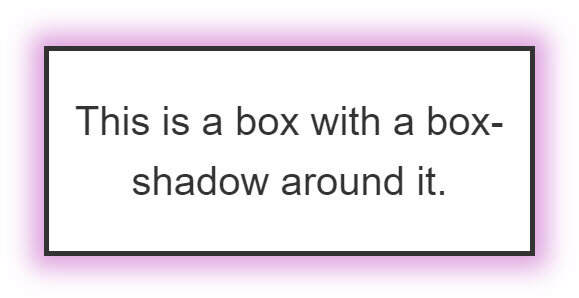
The spread distance essentially provides an effect of depth for the drop shadow. It gives the illusion of the picture being a flat 3D object sticking out of the page slightly. I suggest that this be used sparingly and always with a blur, as it can provide an interesting effect. If there is no offset (0, 0) then the spread will extend across all sides of the image. If there is an offset then it will appear that the light source is fairly angled and that the image has some distance from the background. Here are two examples of a moderate spread distance:

Spread of 5 pixels
box-shadow: 0 0 10px 5px;

Offset spread of 5 pixels
box-shadow: 5px 5px 10px 5px;
It is possible to shrink the spread as well (e.g. -5px), which will shrink the shadows. Play around with the options.
Color
The last setting is color. By default, the shadow will appear gray, but you can change the shadow color to any HEX value, or choose an HTML color name. If you are adding the box-shadow to an element that already has a color (e.g. a blue <div>), then the shadow will inherit that color. If not then you can specify the color. Here are some examples of drop shadows with colors.

box-shadow: 0 0 10px 5px blue;

box-shadow: 0 0 10px 5px red;

box-shadow: 0 0 10px 5px DarkSlateGray;
box-shadow: 0 0 10px 5px plum;
Bonus
You can define more than one shadow for your image. You simply separate the property groups for each shadow with a comma. The syntax would read:
box-shadow: [box shadow properties 1], [box shadow properties 2], [box shadow properties 3, etc.];
In all likelihood, you might not act on this knowledge. But it’s interesting to know that there are some creative possibilities available to you.

box-shadow: 5px 5px 30px 5px red,
-5px -5px 30px 5px blue;
Putting your code into Canvas
Canvas does not support box-shadow as inline CSS, unlike the code we have demonstrated in previous posts, such as creating headings, page separators, banners, and responsive iframes. When you save the Canvas page you are editing, all box-shadow properties will be stript altogether, which means you will need to add your box-shadows to your institution’s external CSS either at the instance level or at a subaccount.
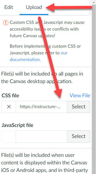
If you have admin privileges, navigate to your institution’s Themes menu and open your active Theme Editor.

In your Theme Editor, click on the Upload tab to access your CSS file. If your institution already has a CSS file, then you can download it and add the new list of box-shadow properties to the file and reupload it. If there is no CSS file then you can simply select and upload your file. Ensure that you test the editor before saving your new theme.
When I am creating my CSS file, I like to be clear with my notes and delineate the elements in my file. For example, here are some of my notes:
/* SHADOWS */
/* List of shadows
*
* Basic Drop Shadow
* Offset Drop Shadow
* Drop Shadow Spread 5px
* One Edge Shadow
* Multi-box Color Shadows
*
*/
/* Basic Drop Shadow */
.shadow1 {
-moz-box-shadow: 0 0 10px;
-webkit-box-shadow: 0 0 10px;
box-shadow: 0 0 10px;
}
/* Offset Drop Shadow */
.shadow2 {
-moz-box-shadow: 5px 5px 10px;
-webkit-box-shadow: 5px 5px 10px;
box-shadow: 5px 5px 10px;
}
etc…
For a more detailed walkthrough of uploading your files to your institution instance or subaccount, refer to the writeup on the Admin Guide on the Canvas Guides resource center:
Other Applications for box-shadow
In this post I have been focusing on drop shadows as an element specifically for images, but these properties can be applied to any element. In our other post, we discussed creating headings and page separators using <div>’s. The drop shadows we have explored today can be added to any <div> or <span>. Here are two examples:
![<div class="border border-trbl [class for your drop shadow]" style="background-color: #7f9c96; padding-left: 25px; text-align: left; color: #ffffff; font-size: x-large;"><strong>First Section</strong></div>](https://images.squarespace-cdn.com/content/v1/5f7257840c54bb295444822f/1613750663087-G8M9G6D8782MR9NRG2EC/box+banner1.jpg)
<div class="border border-trbl [class for your drop shadow]" style="background-color: #7f9c96; padding-left: 25px; text-align: left; color: #ffffff; font-size: x-large;"><strong>First Section</strong></div>
In the code above, you would replace [class for your drop shadow] with whatever class you named for the properties:
box-shadow: 0 0 10px 5px DarkSlateGray;
![<div class="border border-trbl [class for your drop shadow]" style="background-color: #c2c2d6; padding: 10px; text-align: center; color: #33334d; font-size: xx-large;"><strong>Headings</strong></div>](https://images.squarespace-cdn.com/content/v1/5f7257840c54bb295444822f/1613750702625-SB47OAP6JCPG89RVHRUK/box+banner2.jpg)
<div class="border border-trbl [class for your drop shadow]" style="background-color: #c2c2d6; padding: 10px; text-align: center; color: #33334d; font-size: xx-large;"><strong>Headings</strong></div>
In the code above, you would replace [class for your drop shadow] with whatever class you named for the properties:
box-shadow: 5px 5px 10px;
As you explore box-shadow properties, you can play around with various color schemes, depths, blurs, overlaying multiple shadows together, etc. Continue to explore the settings and discover the look and feel that you want for your course content.
Please consider subscribing to our YouTube channel for more Canvas tips and tricks. It is so easy and so free. The only thing you have to do is click this link: http://bit.ly/how2canvas
And follow us on social media
Twitter: https://twitter.com/HowToCanvas
Instagram: https://www.instagram.com/HowToCanvas
Facebook: https://www.facebook.com/HowToCanvas